We place our customers first by embedding
sustainability, quality, technology and
innovation in everything we do.
Our
Logo
Our logo highlights the brand name and the brand mark equally. The frame is an integral part of our logo.
We communicate in dual language,
like our logo.
We communicate in both Arabic and English. Dual language does not mean locking up both languages together on every application. In fact, digital applications such as video allow us to communicate in a sequence i.e. Arabic first, and then English.
Colour & Typography
Our colour palette adds richness and depth to our communications. Colour should be used sparingly and subtly to add sophistication and character.
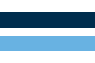
Blues
Aldar is professional, reliable and trustworthy. That’s why we have chosen a shade of dark blue as one of our secondary colour and contrasted this darker shade with a lighter shade that communicates Aldar’s sense of imagination and freedom.

Greens
Aldar aims to create healthy, happy and vibrant communities. Green is the colour of life and represents harmony, health, growth and freshness. It can be both energizing and relaxing depending on the hue and conveys prosperity and sustainability, all qualities that underpin Aldar’s identity.

Yellow/Orange
Aldar is energetic, optimistic and dynamic. We attract attention and communicate happiness and fun. Both orange and yellow help to communicate these attributes and make sure we can grab people’s attention when required.
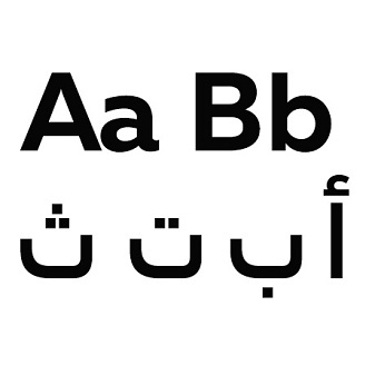
Our Fonts
We use Poppins.
Poppins is our English typeface. It is clean distinctive and legible, reflecting our commitment to communicating clearly and transparently with our stakeholders.
We use Almarai.
Almarai is our Arabic typeface.It complements Poppins, allowing our typography to appear unified and consistent across dual language.
Our Sonic
This is what we sound like. By uniting our visual identity with a sonic style, we have created an auditory experience that not only demonstrates our innovate mindset, but also the way we fuse culture and modernity at every turn.
Orchestral
Local
Orchestral / Light Violin / Khaliji
Electro
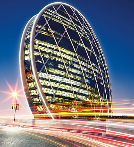
Our photographic style is about capturing moments where people interact and enjoy time together. It focuses on the stories of the communities we serve, and has a strong sense of place.